Skip to content
Tech

Review: Windows 10 is the best version yet—once the bugs get fixed

Your very own personal assistant, a better browser... and something called the Start menu.

Ars Staff | 392

I'm more conflicted about Windows 10 than I have been about any previous version of Windows. In some ways, the operating system is extremely ambitious; in others, it represents a great loss of ambition. The new release tries to walk an unsteady path between being Microsoft's most progressive, forward-looking release and simultaneously appealing to Windows' most conservative users.

And it mostly succeeds, making this the best version of Windows yet—once everything's working. In its current form, the operating system doesn't feel quite finished, and I'd wait a few weeks before making the leap.

From highs to lows

Windows 7
Windows 7 Credit: Andrew Cunningham

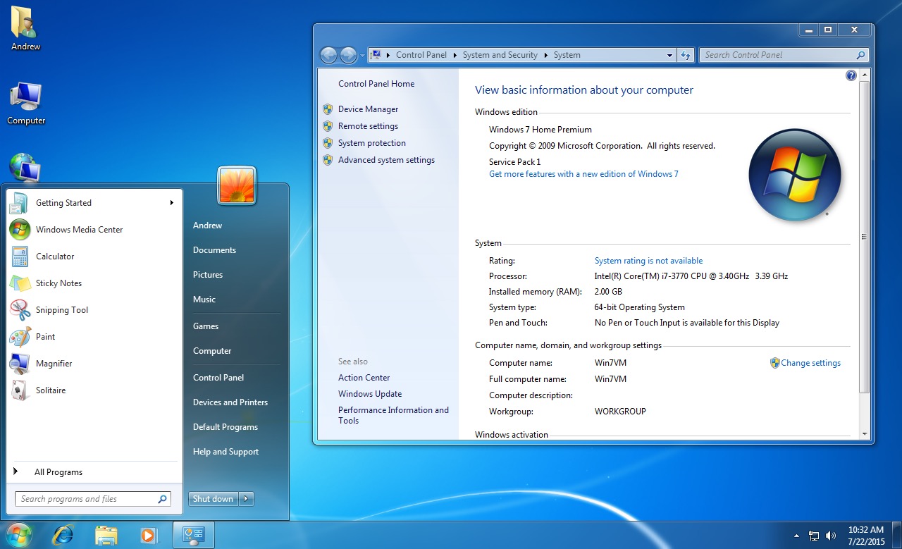
Windows 7 was a straightforward proposition, a testament to the power of a new name. Windows Vista may have had a poor reputation, but it was a solid operating system. Give hardware and software vendors three years to develop drivers, come to grips with security changes, fix a few bugs, and freeze the hardware requirements, and the result was Windows 7—an operating system that worked with almost any hardware, almost any software. It was comfortable and familiar. Add some small but desirable enhancements to window management and the task bar, and the result was a hugely popular operating system, the high point of the entire Windows family's development.

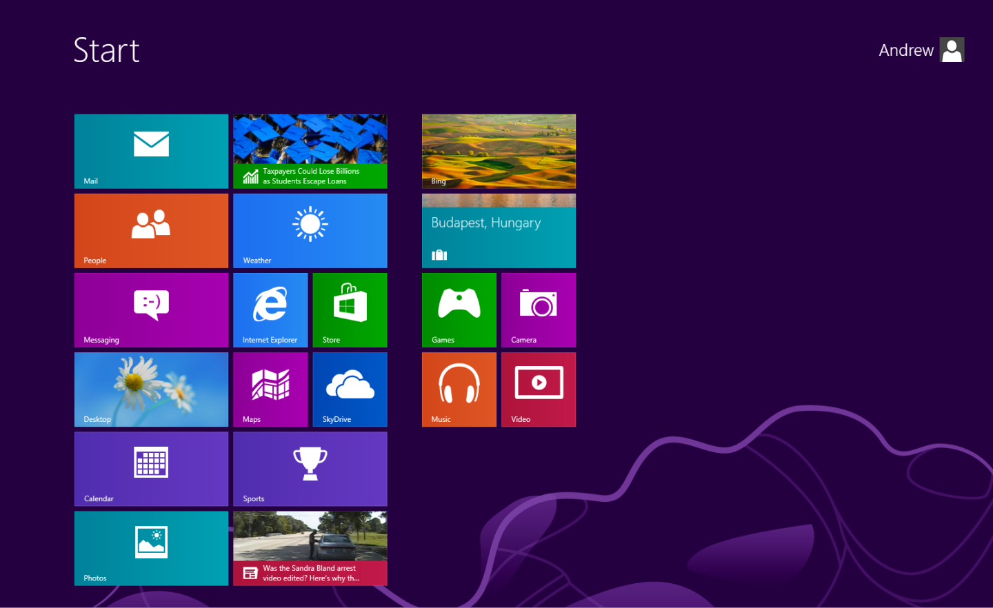
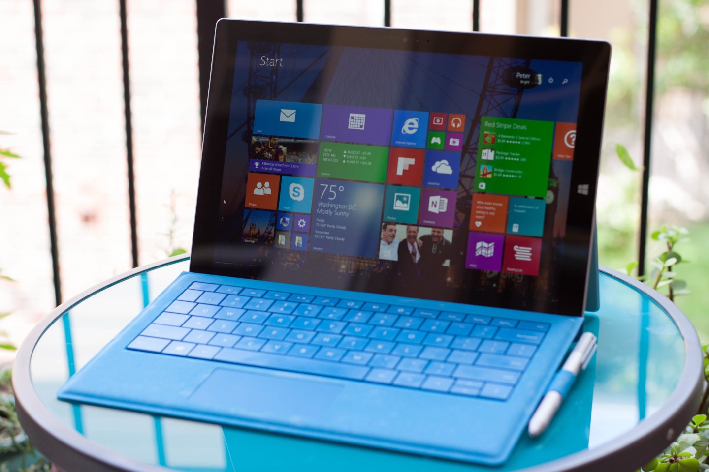
Windows 8 was similarly easy to understand. With it, Microsoft wanted to make Windows work well on tablets while also wanting an operating system that continued to support the enormous legacy of Win32 applications.

Ars Video


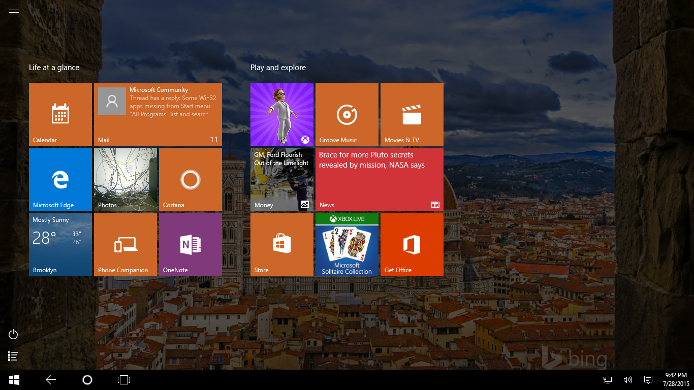
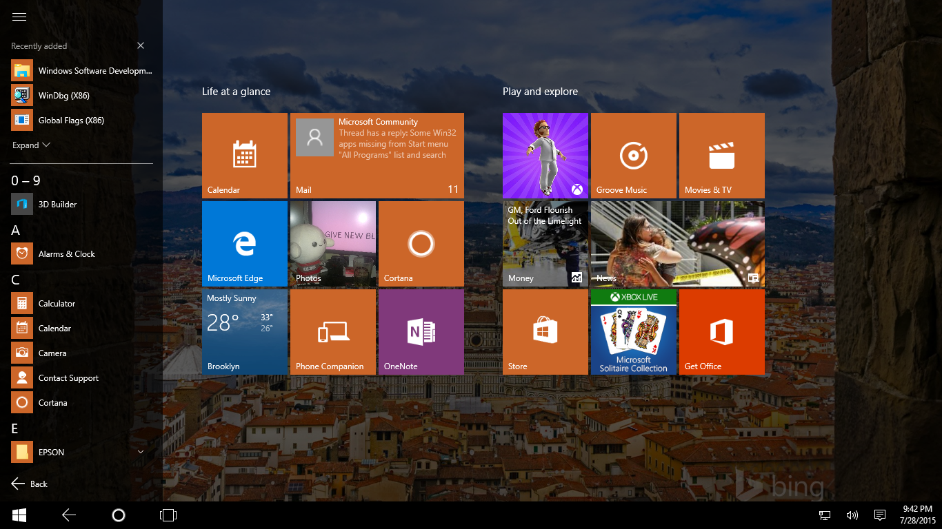
Windows 8 did both of these things—just not at the same time. It contained the basics of a very competent tablet platform, with particularly strong handling of multitasking. It also contained, in most regards, a solid desktop operating system that was very similar to Windows 7. Some things it even made a little better; in Windows 8, for instance, the taskbar finally became multi-monitor aware, ending the need for various third-party hacks.

But these worlds collided in an ugly fashion. The tablet part was never self-contained, with touch users forced to visit finger-unfriendly desktop apps to access a full range of system settings, manage files, and so on. And many desktop users resented being forced to use a full-screen application launcher that, while perfectly functional, was clearly designed for touch users first.

This operating system showcased some of Microsoft's worst habits. Windows has always been a frustratingly inconsistent platform, sporting a mix not just of visual styles but also of user interface elements. It contains, for example, multiple different styles of "menu." While these all do roughly the same thing, they differ both in how they look and in some of the finer points of their behavior. Windows 8 introduced yet another new and very different appearance and set of interface elements to Windows, with no effort to unify and integrate.

Windows 8
Windows 8 Credit: Andrew Cunningham

Make no mistake: Windows 8 wasn't the first Windows version to contain a ton of inconsistencies. It's a longstanding Windows problem. Part of the issue is legacy compatibility. For example, some bits of Windows still use the old-style applet Control Panel system, where settings are configured in grey tabbed dialog boxes, because third parties could add their own tabs to provide extended functionality. Other settings didn't have to support this kind of extensibility and so migrated to the new Explorer-based Control Panel system, where settings could be changed within the Explorer window itself, not separate pop-ups.

But part of the issue is also that Microsoft doesn't seem to care a whole lot about these details. Windows 8 introduced a third style of settings, with its touch-friendly Metro-style settings app. It was very incomplete. Lots of settings required the use of the traditional Control Panel (and sometimes its even older tabbed dialogs), not because Microsoft couldn't migrate them to the new style to retain compatibility with extensibility APIs, but because the company didn't make the effort. This kind of work requires lots of new settings pages to be designed and tested, and Microsoft has never really seemed to prioritize it. After all, it isn't making Windows do anything new, it's just changing the way it does existing things.

Windows 8 took this incoherence too far; the differences were too jarring, the inconsistencies too great. It didn't feel like a complete, fully thought-out operating system, instead being some ideas (an adaptable operating system for both tablet and desktop users) and some partial solutions (the Metro-style apps, live tiles) flung together with little consideration of how this would feel to use.

If Windows 7 was a high point in Windows' life, Windows 8 and 8.1 were considered by many to be a low point. Nearly three years after the initial release, the two Windows 8 versions stand at around 15 percent market share (according to Net Market Share), while Windows 7 stands at more than 60 percent.

Microsoft continually tries to put a positive spin on this situation, saying that consumer satisfaction among Windows 8 users is the highest Windows has ever had. But there's an important proviso: it's true only on touch devices.

Microsoft's Surface Pro 3, a hybrid machine that has found a market.

Since Windows 8's launch, touch PCs have proliferated, and while there was some initially awkward experimentation, manufacturers today have a decent idea of how to do touch systems. While there's still some skepticism about the value of touch on a desktop PC, on laptops it's an attractive feature, especially when paired with perhaps the best form factor innovation that has come from the Windows 8 experimentation: the 360-degree hinge. As an occasional business traveler sitting in misery in cattle class, the ability to use a laptop in "stand" mode or "tent" mode for watching movies is genuinely useful. Touch makes it practical.

Similarly, devices such as Microsoft's own Surface Pro 3 have found a small but growing audience. Its combination of touch, pen, and keyboard has won plaudits, and, while it's still early days, it looks as if Microsoft is starting to build a small but credible PC hardware business.

Which all means that Microsoft's broad desire with Windows 8 was perhaps not entirely off-base. Touch systems are not some discrete category entirely disjointed from more traditional machines. Rather, there's a continuum of devices, ranging from the dedicated mouse-and-keyboard machine through to the tablet that may occasionally be paired with a Bluetooth keyboard and all the way on to the smartphone, which will almost never use anything but touch. Microsoft continues to want to make Windows an operating system that works across this spectrum—and the dream lives on in Windows 10.

Re-embracing the desktop

But first, the company wanted a operating system that wouldn't scare off traditional desktop users, one familiar enough that enterprises wouldn't incur significant training costs. Home users should be able to pick it up as a natural evolution of Windows 7.

To prove to the world that the company has done this, we have the Windows 10 Start menu.

Microsoft is saying that, in Windows 10, the "Start menu is back." It's peculiar messaging. For the many Windows users and enterprises that stuck with Windows 7, of course, the Start menu never went away. For those of us who adapted to Windows 8 and 8.1, its non-presence wasn't such a big deal.

It's also not really true. If you want something that looks and works like the Windows 7 Start menu, then the only Microsoft-supported solution is to run Windows 7. What we have in Windows 10 is something else. Something new. And something sort of broken.

Windows 8.1 addressed some of the major complaints about Windows 8's Start screen—it reinstated the Windows button, for example, rather than requiring the use of an invisible hot corner—but one characteristic of the Start screen was deemed by many to be wholly inappropriate for desktop usage: its full-screen nature. It is this that the Windows 10 Start menu primarily addresses. On mouse and keyboard machines, pressing Start shows a thing that's more or less the same size as the Windows 7 Start menu.

The layout is quite different, however. The righthand side is used not for quick access to your user directory, Control Panel, and a few other places. Instead, it's used to show live tiles, just as were found on the Start screen of old. The left-hand side is closer to Windows 7; it's used to show recently used and new apps and has an "All apps" view that is supposed to show all the apps you have installed.

A new Start menu, not necessarily a better one

However, this is not the All Programs view of Windows 7 and below. In every Start menu-equipped version of Windows, from Windows 95 to Windows 7, the Start menu was driven by a set of folders and shortcuts on the file system. Those folders and shortcuts were all reflected in the Start menu, including their hierarchical organization. As such, organization of the Start menu was user-controlled. Many stuck with whatever random folders applications created when they were installed, of course, but some created their own elaborate hierarchies and structures to group their applications in whichever way they felt was appropriate.

In Windows 10, it's... different. Windows creates a per-user database containing all the entries that are in Start, both the live tile portion and the All apps portion. This database is (inexplicably) maintained by a system service running as the super-privileged SYSTEM identity. And at the time of writing, this database has the oh-so convenient feature of being limited to around 500 entries.

On fresh Windows 10 installs you'll probably never notice the difference, since it'll take some time to build up 500 or so entries. On my main PC with a full install of Office 2016, the Adobe Creative Cloud suite, Visual Studio 2015, Visual Studio 2013, and many more applications besides, I blew right past this number. The result? The All apps view didn't show all my programs. This would be tolerable if that's all that happened. Stupid and annoying, but tolerable, because since Windows Vista, I've launched apps from Start in exactly one way: by typing the name of the app to search for it. I don't really care about All apps at all.

Except that searching breaks, too. For search-to-start apps, Windows appears to use the same database. If that database is incomplete (because you have too many entries) then too bad, so sad; it won't find your apps and you'll have no good way of launching them.

Better yet, even if you reduce the number of apps to below 500 or so, it doesn't fix anything. There's no easy way to make it re-read all the short cuts in the Start menu directory (that still exists, because it's where installers expect to put their icons) to regenerate the database. This problem has bitten me and a few others.

I'm hoping that Microsoft will release a patch soon, because it's quite debilitating right now. And the entire thing perplexes me. In principle, the upgrade floodgates are going to open now that Windows 10 is officially out. I daresay that most Windows versions never have many people upgrade them. Upgrading is always an option, of course, but mainstream users tend to keep the operating system that their hardware came with. Even among those who switch operating systems, many prefer clean installs to the in-place upgrades. In clean installs, the 500 entry limit is going to be hard to hit.

Where oh where are all my icons, Start menu?

But Windows 10 promises to shake that up. In-place upgrades to Windows 10 should be abundant. Even Windows 7 systems that may have been in regular use since 2009 will be offered the upgrade. And this means that people are going to have machines with lots of apps installed. Windows 10's new Start menu is going to deny them access to some of those apps.

The entire design of the database system is baroque. I can perhaps see some justification for the database itself; for the live tiles portion of Start, there needs to be a record of what tiles you have and how you have arranged them. For search, you probably want some kind of cache rather than crawling through the file system every time someone tries to search for an application.

But using a service to maintain this database (rather than a regular user process) and making the entire thing opaque with no easy means of altering it or modifying it... it's bizarre. That the database doesn't track changes to the file system and remain up-to-date is weird. And that the database has such a ridiculously low limit on the total number of apps is inexcusable.

This new design also appears to break things that were possible in Windows 8.1. In that operating system, the Start screen layout was maintained by the Start screen itself, and it was possible for administrators to roll out standard sets of pinned tiles to systems they were deploying. Admins could, for example, pre-pin line-of-business apps. Windows 8.1 also supported syncing the Start screen between devices; the capability is gone in Windows 10. Quite why Microsoft felt it necessary to gut the Windows 8.1 All apps and tile view is beyond me. The Windows 8.1 system worked. The new one doesn't.

With a few programs installed, the traditional Start menu is actually a disaster.
With a few programs installed, the traditional Start menu is actually a disaster. Credit: Microsoft

The live tile portion of the Start menu is straightforward. Since Windows 8.1, live tiles have been spruced up a little; they have a new animation for flipping between pieces of information, and there's a new double height, double width square size available. The Start menu can be resized by dragging its edges; if you want more live tiles, you can make it bigger, and if you don't care for them at all you can get rid of all of them and eliminate the space they take.

I continue to like them; they provide a convenient dashboard for things like news and weather (I have come to enjoy the steady stream of nearby murders and assaults that Cortana's tile tells me about since moving to Brooklyn) and are great for keeping track of appointments. They're genuinely more useful than plain icons, or even icons with a counter in the corner.

While I'm unhappy with the specific details of how the Start menu has been implemented and the bugs that it has, I think it's going to achieve Microsoft's goal of reassuring traditional desktop users handily. While it's not an exact clone of any previous Start menu, it's close enough to seem familiar. The addition of the live tiles makes it better.

I'm also not sure it represents quite the victory that Start menu fans think it is. The Start menu continues to be a problematic user interface. It simply doesn't scale very well. Even if all my icons were showing up correctly—and I'm sure they will eventually—All apps view represents a poor way of finding the icon I'm after. Windows 10 does nothing to really make it any better.

Arguably, the Start menu took a big step backward with Windows Vista, which replaced the conventional fly-out menus used in Windows XP and below with the weird expanding-in-place scrolling list. Fortunately, searching was also introduced in Windows Vista, and that works well (though again, it's broken for me until the icon limit is relieved). That's a big part of why Windows 8's Start screen never really offended me; the change from a menu to the tile view didn't change how I launched programs. The process was the same: hit the Windows key and start typing. I'm convinced that this is far and away the best way to start programs on Windows.

Making Metro matter

The Start screen being full screen wasn't the only way in which Windows 8 offended traditional desktop users. The same complaint was leveled against the Metro apps. This was tempered somewhat by the shortage of useful Metro apps, making it more of a hypothetical concern. Of course, these factors are interrelated. With most Windows users being desktop-oriented, the fact that Metro apps were unappealing to desktop users meant that there was little incentive to develop good Metro apps in the first place.

It wasn't just their full-screen nature that made these apps feel overly tablet-oriented. The charms interface, that used a swipe out from the righthand edge of the screen to reveal options such as search, settings, and share, was similarly a weak fit for desktop users. Windows 8 used a system of decidedly non-obvious hot corners to reveal the charms, and while it all undoubtedly worked, it was never particularly natural.

VLC is a Windows 8.1 Store app. Notice how its title bar has a diagonal arrow (for full screen) and a hamburger menu. Twitter, behind, is a Universal Windows App. Notice how its title bar is unadorned.

Windows 10 takes the obvious step of putting the windows back into Windows and putting the Metro apps into windows. These apps broadly have two appearances, depending on whether they were written for Windows 8, and the charms, or designed for Windows 10's Universal Windows Platform (UWP) from the outset. All Metro apps get stuck into a window with a title bar. For apps built for the Windows 8.1 Store, the title bar includes a fourth button at the top right to make the app full-screen and a hamburger menu in the top left. That hamburger menu includes the charm options (search, share, settings) and also an app bar option for apps that have an app bar.

Using those charm options is oddly inconsistent. The app bar and settings panel both open within the window, sliding in from the bottom or the righthand side of the window, respectively. But share and search slide in from the righthand side of the screen. I don't fully understand why they're treated differently.

UWP apps have none of this; no special full-screen button and no hamburger menu for access to charms. UWP apps that want equivalent functionality are meant to integrate those features into their interfaces directly. For search, share, and settings, I think this is reasonable.

It's better, we promise.
But Settings is scoped to within the app itself. Very strange.

I do wish, however, that UWP apps retained the full-screen button. I don't think that full-screen apps are as outlandish on a desktop or laptop system as some of Windows 8's critics, and I note that OS X has had quite some success with this very concept. The initial introduction of full-screen mode to that operating system wasn't perfect, but it has been refined and improved and adopted by both users and developers alike. Putting Metro apps in windows is fine, and probably necessary—but I wish Microsoft had also taken the opportunity to improve the full screen mode, too.

For the most part, this works well. We don't have a ton of UWP apps available yet—the notable ones are the built-ins, such as Store, News, and Maps, and the touch Office apps—but so far they seem reasonably at home on both desktop machines and touch devices.

It's clear that apps can be built that competently span both input modalities and the new windowing again makes them more familiar and usable to desktop users. That addresses one of the problems the Metro apps had; the other is that the first generation apps often weren't tremendously useful. The news on this front is getting better. Things like the touch Office apps show that Metro apps can offer useful functionality, and even some of the built-in Windows 10 apps, such as Mail and Calendar, are well worth using.

With apps like this, it's possible to imagine people using the Metro apps even on desktop machines and, in turn, using the Windows Store to find and even buy apps. That wasn't really the case in Windows 8.

Superior Snap

Windows 10 doesn't just make the full-screen world of Windows 8 a more familiar fit for desktop users. It also makes the desktop experience better in its own right. There's an enhanced Aero Snap and, for the first time in Windows, a virtual desktop system.

Aero Snap, the feature that lets you tile windows to the left or right half of the screen simply by dragging them to the screen edge, has been improved in three ways. First, it now supports quadrants as well as halves. Drag a window into a corner and it'll neatly fill a quarter of the screen—a simple way of making Aero Snap even more useful on large screens.

Second, putting together side-by-side pairings is now a little more streamlined. Snap a window to the left or the right, and the other half of the screen shows thumbnails of all your other windows. Clicking any one of them will snap the chosen window to that half. If you don't want to snap a second window, clicking the first dismisses the thumbnails. The system is very similar to the way Windows 8.1 handled partial width Metro apps; it's now extended to work with any apps.

Quadrant snapping on the right, and snap suggestions on the left.

The third change, and the one I'm most pleased by, is that Aero Snap now has full support for multiple monitors. In previous versions of Windows, snapping only occurred at the "edges" of the display—you had to drag the window until it stopped moving before it'd snap. This naturally meant that multi-monitor systems couldn't snap on the interior edges between screens, only the outer ones. There was a workaround of sorts; using the keyboard shortcuts, windows could be docked to the sides of any screen, even a middle one.

In Windows 10, however, the edges of the screens are all "sticky." Drag a window quickly from one screen to another and there's no interruption, but drag it deliberately to the screen edge and it'll meet resistance and offer to snap into place. The corners likewise are sticky.

The virtual desktop feature is straightforward enough. Press Win+tab, or click the Task View button on the taskbar, and you switch to a sort of bird's-eye view of all your windows. From here, you can create new virtual desktops, with each desktop having its own collection of windows.

Task View can be a little overwhelming.

I'm not much of a fan of virtual desktops; I find that I'm forever losing windows or finding that they're in the wrong desktop at the wrong time. Microsoft's implementation seems to work, but I suspect that virtual desktop aficionados will find them a little lacking. For example, there doesn't appear to be any obvious way to move a window from one desktop to another without going into Task View; I think most people would want an option accessible directly from the taskbar or application title bar. There also doesn't appear to be any facility to have sticky windows that show on every desktop—useful for media player controls, for example.

The question for me is: does Microsoft intend to flesh out the virtual desktops to make them a well-rounded, robust implementation, or is this all we're going to get? I hope this is simply version one and that there will be future iterations.

A more welcome mobile-inspired feature

Of course, sometimes a feature can be "made for tablets" and still be very welcome on the desktop. Every mobile operating system these days has some kind of a notification center that shows you recent notifications until they're dismissed, along with a set of quick-access buttons for doing things like picking a Wi-Fi network, changing the screen brightness, or entering flight mode.

Windows 10 adds a notification center with a set of quick action buttons. It's self-explanatory and a good thing to have in the operating system. In fact, it's a little strange that it took the rise of the smartphone to get this kind of thing in our operating systems—it's not as if notifications aren't abundant in desktop software, after all. The notification area even respects established mobile operating system norms by appearing when you swipe in from the edge of the screen.

Throughout the Windows 10 preview program I suffered issues wherein the names of the programs generating the notifications didn't appear properly. Instead, it showed an internal identifier, such as a GUID or some other programmatic ID that should never be shown to actual humans. Unfortunately, this problem has persisted in build 10240, and so my Outlook notifications do not purport to come from Outlook 2016; instead, they claim to come from Microsoft.Office.OUTLOOK.EXE.15. I'm not even sure how to fix this or how it broke in the first place.

In time, the notifications will start to be actionable, with buttons on them to directly perform quick actions from within the notification area itself, rather than having to switch to an app. I'm not sure, however, if this capability is available right now or how long it will take applications to update to support it. I long for the day that Outlook reinstates the delete button on its notifications, a much-loved feature that went missing when Outlook was changed to use the Windows 8 built-in notifications rather than its custom ones.

Mobile isn't forgotten: Continuum

Windows 10 does much to make it a better platform for traditional desktop users. Does it do enough to win over those who stuck with Windows 7 and angrily argued that Windows 8 was only good for tablets? Probably not all of them—there are still people out there who feel that Windows XP was Windows' peak and argue that Microsoft should have just stuck with that—but I suspect most. Windows 10 doesn't try to shake up the way that desktop operating systems are built or how they work.

Microsoft, though, is still committed to a wide range of touchscreen devices running Windows, including devices that are first and foremost designed for use as tablets, and a wide variety of convertibles. This includes the company's own Surface line. Windows 10 has to work for those, too, and looking and feeling like a traditional desktop operating system isn't the way to do that.

Windows 8 had two styles of interface—the fullscreen Metro world and the traditional windowed desktop world—and they operated more or less simultaneously. If you used a mix of Metro and traditional desktop apps, you'd find yourself endlessly switching between these two worlds. Even if you wanted to stick with one universe or the other, the operating system would force you to switch back and forth.

In Windows 10, we in fact still have those two worlds. But instead of being concurrent, with some software stuck in one world and other software stuck in the other world, they're now modal. Windows 10 has two user interface modes: traditional desktop mode, with windowed applications and a Start menu, and tablet mode, with full-screen applications and a Start screen.

Cortana shrinks to an icon, the taskbar is tidied, and the Start screen goes full screen.
All programs still exists.

Hardware with a mouse and keyboard will default to the desktop mode. Touch-only devices will default to the tablet mode. And hybrid devices? They'll switch back and forth. Tear the keyboard off a Surface Pro 3 and it'll ask if you want to switch to tablet mode. Make the switch, and it'll transform from a windowed desktop environment into a full-screen tablet one. All your applications will continue to run; they'll just run full screen (or split screen; Windows 8's side-by-side multitasking remains possible). The Start screen, similarly, becomes a full-screen equivalent of the Start menu. It'll use the same live tile layout and all apps view, it'll just be bigger in a nod to tablet conventions.

The taskbar also changes (by default, though this can be overridden) to make it feel more tablet-like. The icons for running apps are removed, as are most of the notification icons. A back button, however, is added. This works much as its counterparts in Windows Phone or Android, and I assume the purpose is to make application navigation more consistent between phone and tablet apps.

Switching between modes is optional and can be overridden at any time. Existing Windows devices might even need firmware or driver updates to fully support the automatic mode switching—hardware companies need to make sure that the right signal is sent to the operating system to indicate that it should use a different mode.

Continuum is how Windows 8 should have always worked. It lets the operating system play to the strengths of the hardware it's running on, even as that hardware changes.

It's not all good news, however. While Windows 8's "invisible" user interface was problematic on desktops, it felt very natural on tablets; the edge-based interface that used swipes from the screen edges was comfortable and, more importantly, familiar. Swiping in from the left to flick between tasks (a kind of touch-based alt-tab) brought a convenience to tablet multitasking that was quite rare. Similarly, swiping in from the right to reveal a Start button (nestled among the charms) was quick and effective. It put this important button right under your thumb when holding the tablet two-handed.

Both of these are now gone, and tablet usability takes a step backward as a result. Swiping in from the left is still used for task switching, but now it brings up the Task View screen, with thumbnails for all the open apps instead of the direct switch. Swiping from the right shows the notification center. These things are both useful, of course, but the simplicity and elegance of the Windows 8 system has been sacrificed.

Hitting Start now requires moving my hand to the bottom left of the screen (except on the Surface Pro 3, which puts the hardware Start button in more or less the same place as Windows 8's software Start button). App switching now makes me ponder for a moment as I pick the app from the thumbnails, instead of being automatic and reflexive as it was in Windows 8. I really hope that these decisions can be revisited in the future.

Talking to your computer is weird

The notification center isn't the only mobile-originated feature to land in Windows 10. Microsoft's Cortana virtual digital personal assistant is one of the headline features of the new operating system—at least if you're lucky enough to live in a country that she works within and speak a language she understands.

We're already familiar with Cortana from Windows Phone 8.1 and her recent Android incarnation. Windows 10 doesn't shake up the basic formula: Cortana tracks your calendar and mail to help manage your schedule, she follows your interests to tell you things that you'll probably be interested in, and she responds to natural language queries and instructions to both answer your questions and perform actions for you.

Her desktop incarnation isn't tremendously different. The biggest practical change I noticed is that in Windows 10 she supports the "Hey Cortana" feature on any system with a microphone—you can get her attention and give her commands at any time, just by saying "Hey Cortana." This is only available on a limited number of phone models.

From left to right: Cortana's regular useful info, some of her chitchat, and her integration with other apps.

I've come to use Cortana a reasonable amount on Windows Phone, and I expect to do the same in Windows 10. I still feel goofy giving instructions to my phone to tell her to, for example, set reminders or send messages, but the functionality all works for those who want it. Here, it has translated well onto the desktop. The speech recognition is decent, if not perfect, and will grow better as more people use the service. If you make a textual fix to a dictated message, the information is sent to Microsoft and used to update its speech recognition engine.

Cortana is also extensible in some ways. Apps can register for voice commands, enabling Cortana to invoke app features from spoken instructions. This extensibility is limited, however. Cortana plumbs into the UWP Mail and Calendar apps, but she can't plumb into regular desktop Outlook, for example. This isn't the end of the world, as it's possible of course to set up the Mail and Calendar apps in addition to using desktop Outlook. Still, it'd be a little more elegant if she could just tap straight into Outlook.

Microsoft has shown some other kinds of integration that aren't ready now but should be coming soon. For example, if I have an offsite appointment or a tracked flight, Cortana can alert me when I need to leave the house, given prevailing traffic conditions. An obvious extension of this would be to plumb her into, say Uber, so that she can tell me not only that I need to leave, but also offer to book me a car and tell the car what the destination is.

Cortana's weird language limitations are also a little annoying. Windows has a range of different language settings; there's the language the user interface uses, the language the speech engine uses, and the region used for the Store and other online services. I would like to be able to use a UK user interface, a UK speech engine, but a US Store region, given that I'm a British ex-pat living in New York. Cortana supports both American and British English, so there's no obvious reason why this shouldn't work. But it doesn't. She requires the region, speech language, and (I think) UI language to all match.

Mismatch the languages and Cortana will stop working. Worse, I found she didn't even explain why she wasn't working; she claimed that she'd been administratively disabled. Changing my language settings back made her spring back into life.

I realize that this is a minor concern and that most people will have all the settings matching appropriately. But in a product with as many users as Windows, even minor concerns can affect a lot of people. The restrictions also feel quite arbitrary; it'd be understandable if I wanted to use a speech language that Cortana simply didn't understand, but that's not what I'm trying to do.

Edge: Almost a great browser

There's a taste of the kind of Cortana integration that might become more common within Windows 10's shiny new browser: Edge. Windows 10 still includes Internet Explorer, but by default there's no icon for it and no immediate way of starting it. Edge is the new default browser, and it's placed front and center.

On the inside, Edge is based on a heavily modified version of the old Internet Explorer rendering engine. Microsoft forked that engine to create a new engine, also called Edge. Edge is designed for the modern Web. The abundant legacy compatibility features—such as ActiveX, rendering modes that emulate old browser versions, and VBScript scripting—have all been removed. The Internet Explorer dev team claims to have removed hundreds of thousands of lines of code that were used to provide this legacy support.

With this new, cleaner codebase, Microsoft has been quicker to add new, standards-compliant capabilities, and it also substantially boosted the browser's performance. Anandtech ran through a typical set of browser benchmarks and found that Edge was strongly competitive with the performance of Chrome and Firefox. The results include a huge leap (relative to Internet Explorer 11) in the browser's score in Google's Octane benchmark, going from worst mainstream browser to best.

Cortana (which is to say, Bing)-powered information from the address bar.
Scribbling on Web pages.

In my use, Edge is tremendously promising. It feels both faster and substantially more stable than Internet Explorer 11 ever did for me, and it renders pages attractively. I've also found compatibility to be good. Although lacking ActiveX support, and hence most plugins (including Microsoft's own Silverlight), Edge has a built-in version of Flash, which is sufficient to fill most of the gaps that HTML5 can't reach. Edge uses a compatibility list that's periodically fetched from the 'net, and it'll prompt you to open sites from the list in Internet Explorer. I've only hit this once so far, and as luck would have it, it was Microsoft's own Update Catalog that triggered it. Enterprises will have more control and, for example, will be able to redirect their intranet sites to Internet Explorer if necessary.

I also think it's pretty good-looking; it has a dark theme, and the minimal aesthetic appeals to me.

However, it's not ready for daily use yet, at least not for me. The problem is features. Edge is severely feature-deficient right now. I don't require a ton from my browser, but I do depend on things like pinned tabs and a handful of extensions, including the 1Password password manager. Edge currently has neither, though extensions are promised for later this year. Edge is also a little awkward at things like tearing tabs out of one window and putting them into another. It works, just about, but it's glitchy and annoying. The same capability works perfectly in Internet Explorer 11 and Chrome.

The two significant features that Edge does have are Cortana integration and a page annotation system. The Cortana integration builds on the things that Cortana already does. For example, type a question into the address bar, such as asking about the weather or a unit conversion, and you'll get an answer in place. Visit a restaurant Web page and Edge can show you Yelp reviews, mapping, OpenTable booking, and so on. In practice, none of the restaurants I use triggered this feature, even though Bing searches for the same restaurants showed that they were definitely known and recognized as such.

Web Notes allows you to scribble on any webpage to add notes, annotations, and comments onto any page. You can save the annotated form into OneNote or copy and paste snippets into other apps. While I can see this being very useful in some narrow cases—Web development, for example—it's not a feature I've ever found myself crying out for. Honestly, I find it a little strange that Microsoft developed this as a version 1 feature instead of something like extensions.

That strange prioritization aside, I have really high hopes for Edge. You can feel the work that Microsoft has done, and at its heart, it is a much better browser than Internet Explorer ever was. It's not the right browser for me right now, but I can well believe that it could be one day.

The most secure Windows ever... again

Every Windows is the most secure ever, and Windows 10 is no exception. It has a couple of novel security features that are worth looking at.

The first is biometric login. Windows has supported third-party biometric logins for a long time, and, since Windows 7, it has had a built-in driver framework for biometric hardware making it easier for software to incorporate biometric support. Windows 10 upgrades and extends this.

The Hello feature supports three kinds of biometric: fingerprint, facial recognition, and iris scanning. The one I've used is facial recognition. This can't be used with any old webcam; it requires depth-sensing 3D cameras, which means it (supposedly) can't be faked out with photographs. The system works entirely transparently; to log in, I simply have to sit down at the computer's login screen and it recognizes me. This would pose an issue when trying to lock the computer—it would unlock from recognizing your face as soon as you locked it—but Microsoft has noticed that issue, and so there's a short timeout period after locking the machine during which Hello can't unlock it.

Say Hello to Windows 10.
Say Hello to Windows 10. Credit: Microsoft

Microsoft is keen to point out that Hello never risks leaking any of the raw biometric data; it keeps it all on the device, within a TPM chip. If you have multiple systems, you'll need to enroll your biometric data onto each of them individually. Enrolling also requires PIN-based logins to be enabled.

The big problem with Hello is that its hardware support is very limited so far. Facial recognition is currently supported only with Intel's RealSense 3D camera, which is found in a handful of laptops and all-in-ones on the market (I tested it with Intel's developer hardware). The fingerprint recognition should be more compatible, and I don't believe that there is any suitable iris recognition hardware on the market yet.

The underlying platform framework for Hello is called Passport. Microsoft's intent is that this biometric support will, in time, be usable even within the browser to securely log on to sites and services without the use of a password, using the FIDO specifications.

I really hope that manufacturers get on board with Hello's hardware requirements. While I'm not convinced that it's more secure than a good, strong password, the reality is that most people don't use good, strong passwords. A face or fingerprint is likely to be a substantial net improvement for their security, and so the more widespread this kind of thing is, the better.

Windows Hello is available in every version of Windows. Some of the other, more esoteric new security features are found only in the Enterprise version. They too require special hardware, but this time, it's a processor with virtualization capabilities. These features are designed to combat two things: the running of unauthorized software (such as malware), and a particular kind of user-credential theft and re-use, called pass the hash.

In pass-the-hash attacks, we assume that an attacker has already compromised a machine and gotten Administrator privileges on that machine. The risk is to other machines on the same network, in the same Windows domain; the attacker on the compromised machine can read Windows authentication credentials stored in memory (Windows keeps them in a process called LSASS, the Local Security Authority Subsystem Service) and then use those credentials to access other machines on the network. Some of these credentials can even be reused over and over again to provide longterm, persistent access to networked machines, and if LSASS of a Domain Controller is captured by an attacker, then the entire Windows domain becomes compromised and should be torn down and rebuilt.

Microsoft has done various things to try to mitigate these attacks, but none of them have fully addressed the issue. There are complicated constraints such as the need to continue to be able to authenticate against legacy systems and the requirements imposed by particular authentication protocols. Windows 10 should provide the most robust protection yet against this kind of an attack.

To do this, it uses Hyper-V virtualization. Hyper-V in Windows 10 (and, perhaps more importantly, Windows Server 2016) has a new feature called "Shielded VMs" that allow the creation of virtual machines that the system administrator can't access or tamper with. Windows 10 creates a special Shielded VM called Isolated User Mode, running a small, cut-down, secure kernel, SKERNEL. This VM doesn't contain any third-party code, doesn't have a stack of device drivers, and doesn't have a GUI or anything like that. It's used for running a limited selection of highly trusted processes.

One of these is a kind of cut-down LSASS called LSAiso (that is, isolated LSA) used to store authentication credentials. Because it's in a Shielded VM, even an Administrator has no access to the VM's memory or all the secrets contained inside.

Obviously, the full operating system does need access to these credentials in some capacity. There's a special API for the regular LSASS (now without any credentials) to ask the LSAiso for credential information. LSAiso doesn't return the credentials themselves, delivering instead information derived from the credentials. This information is created in such a way that an attacker can't simply save it and reuse it over and over again.

Device Guard is a system designed to protect against malware. The traditional approach toward malware is that code is trusted by default. Unless anti-virus software detects a program as specifically being a threat, then the program is allowed to run. Device Guard takes the opposite approach; programs aren't allowed to run unless they're not a threat (which is "proven" by the presence of cryptographic signatures).

This kind of signature-based verification has been done before, including with Windows' own AppLocker technology, but Device Guard adds a twist: it's protected from tampering and malware by leveraging the special Isolated User Mode VM and using that VM to ensure the integrity of the operating system.

This isn't a showy feature—in fact, there's barely indication it's in use, other than your system having 1GB less usable memory (that's how much the protected VM takes) and an extra process running—and initially it's going to be pretty unusual. Not only does it require the Enterprise version of Windows, it also requires the use of hardware CPU virtualization (VT-x on Intel processors, AMD-V on AMD ones) and I/O virtualization (VT-d on Intel processors, AMD-Vi on AMD ones) along with TPM hardware and UEFI Secure Boot.

Nonetheless, it's a neat feature that uses the hardware to address real security problems. One can imagine that, given time, something like this could become a standard feature. The ability to store secrets safely and make the kernel hard to tamper with is clearly useful to more than just enterprise users, even if the specific concerns of pass-the-hash aren't really applicable outside the corporate environment.

Windows never changes

In some regards, the worst bit about Windows 10 is that it's still Windows. That legendary inconsistency remains a factor in Windows 10. The new OS changes the Windows theme again, and I really like it. The thin borders and sparse use of color appeal to me, and for those who find it a little too bland, there's still an option to colorize the window chrome.

But the gulf between traditional desktop apps and new UWP apps remains. They don't look the same or act the same, so things like context menus look very different between the two. I wish, wish, wish that Microsoft cared more about this. I can sort of accept a kind of "generational" difference, with applications built for one era looking one way,and applications built for another era looking another way. However, Windows 10 isn't even that consistent.

For example, the taskbar and Start menu have at least five different styles of context menu depending on where exactly you right click. Right click a blank spot on the taskbar, and you get a traditional Windows menu with updated shapes for checkmarks and submenus. Right click Cortana's input box, and you get a white menu with a black border. Right click an icon for a running app, and you get a dark grey menu with no border. Right click a live tile, and you get a dark grey menu with a light grey border. Shift right click an icon for a running app and you get a menu that's similar to, but slightly darker than, the menu from right clicking a blank spot on the taskbar.

Update: A previous version of this article said that there were four styles of context menu accessible from the taskbar. It has been updated to correct this error.

And this is all new code. I mean, I don't doubt that the taskbar/Start menu include portions of old code, perhaps even dating back as far as Windows 95. But unlike, say, Notepad, this code is all actively maintained, developed, and improved. It's just wildly inconsistent.

When you look even further, you find even more variations. Microsoft Management Console, the app used for Device Manager, Computer Management, and many other administrative controls, has its own menus that are different from the normal ones used in Notepad. Internet Explorer 11 has different menus again. Right click Task Manager when it's running in the notification area. Another menu style, again.

Right click a taskbar icon.
Right click the taskbar.

I'm not going to claim that Windows 10 is as disjointed and divided as Windows 8 was, because it's not. The new Settings app, for example, is great progress. It still doesn't contain every setting, so some tasks still need the use of the legacy Control Panel with its mishmash of styles, but it is at least now reasonably complete. Pretty much all of the common settings use the new style. The new theme, similarly, doesn't make desktop apps and UWP apps look identical, but they do at least now look as if they're related. As if they probably belong together. The new icons in Explorer also help a little.

it's certainly getting better, but Windows has nowhere near the same degree of uniformity as, say, OS X. This makes me a little bit sad every time I use it. If Microsoft wants third party developers to take care over fit and finish in order to produce polished, attractive applications, it needs to do a better job of leading by example.

Going forward, I expect Windows may get a bit better at this stuff. Microsoft has long had a reputation of "dogfooding" its own products. That is, it "eats its own dogfood:" the software that Microsoft builds to sell other people is also the software that Microsoft uses internally to run its business. This means that the software the company makes must be production quality, and it must do the things that people need it to do in order to get their jobs done.

This remains true, but only in broad strokes. Microsoft may very well have used Windows internally, but at a lower level, it has been quite bad at dogfooding. Take, for example, the WinRT API used for building applications for the Windows Store in Windows 8. While the Start screen and Settings app in Windows 8 used the same kinds of design features and concepts as Windows Store apps were supposed to, they didn't use the same set of WinRT APIs. Accordingly, Microsoft never had to "battle test" its APIs for important internal apps, giving the company a poor sense of whether the APIs were sufficiently capable or reliable enough to build real software.

Going back in time, a similar situation emerged around Windows Presentation Foundation, the .NET-based graphical framework introduced simultaneously with Windows Vista. Microsoft told third party developers to use it but didn't use it itself. WPF suffered a range of performance issues, causing great pain for third parties, but it wasn't until Redmond started using WPF in earnest (for building Visual Studio) that these issues were addressed.

Dogfooding APIs is important for ensuring those APIs are viable. It's also important for creating more consistent software. If Microsoft has its own internal library for creating applications, with its own special menus, and its own special scroll bars, and so on and so forth, it's no wonder that these things all look different. Different teams within the company will have their own libraries—all slightly different—and third parties likewise will be using different libraries. In this kind of world, software is never going to look and feel uniform.

With Windows 10, Microsoft's developers have made a much more concerted effort to use the same APIs as third parties are meant to use. The Start menu and Settings app, for example, both now use the UWP APIs, the same ones that people writing Windows software use. As such, they're all much more likely to work the same way. If this continues, we should see Windows start to feel like a much more coherent, single platform as time goes on.

A new Windows platform

Microsoft is making a big sales pitch to its developers: build apps for Windows 10 because it'll soon have a billion users. Not traditional Win32 apps, but apps for the Universal Windows Platform, the current name for the WinRT API. And these apps won't just run on desktops and hybrids. The apps, and Windows itself, aren't just for PCs, laptops, and hybrids. They'll also run on small tablets, smartphones, the Xbox One, and, one day, Microsoft's HoloLens.

This platform is being delivered in a different way from any prior Windows release as well: "Windows as a Service" (WaaS). Windows as a developer target poses two main problems today. First, it's quite slow to accumulate new features (for example, support for new hardware capabilities or form factors), because with one release every three years, there are huge gaps between each release. Second, it's quite fragmented. Most people don't upgrade to a new operating system when it's released; they just stick with the one that came preinstalled. This means that developers often target the lowest common denominator—not the latest and greatest release, with few users, but the previous release, or even the one before that, to maximize their audience.

The basic principle of WaaS is that Microsoft will deliver a steady stream of feature updates to the operating system, providing not just security fixes but new features and more general bug fixes. We won't have to wait until Windows 11, for example, for Edge to add extension support. It'll just come in an update later this year. The lengthy waits for new capabilities should be a thing of the past.

Moreover, the flow of these updates will never stop. While I wouldn't actually put money on it, it's possible that there will never be another Windows brand and that we'll be updating our "Windows 10" for the indefinite future. While old machines will, eventually, be left behind due to incompatible hardware changes, this will be rare. For the most part, all Windows 10 users will be able to run the latest and greatest version of the operating system.

Accordingly, developers will be able to write apps for the latest and greatest Windows release, confident that they're not excluding a large part of their market in so doing, and avoiding the fragmentation that currently hits Windows.

As of right now, however, virtually none of the Windows user base is using Windows 10. To prime the pump, Microsoft is making it a free upgrade for Windows 7, 8, and 8.1 users, for one year starting tomorrow. This upgrade will be delivered through Windows Update to home users, and it could well give Windows 10's uptake a big early boost.

This isn't without its issues. To help maintain that ideal of a single, up-to-date Windows platform, Windows 10 Home makes all updates compulsory. Windows 10 Pro allows updates to be deferred, but only for a few months. The overall effect of this is likely to be that Windows is more reliable and more secure for more people, but it has raised concerns particularly around the drivers that Windows Update distributes.

While many drivers, such as those for USB controllers or printers or webcams, are broadly unexceptional and safe to update through Windows Update, other kinds of driver, particularly those for video cards, can be a little more temperamental. It's not unheard of for these drivers to introduce game crashes or visual glitches, or sometimes even system crashes. As such, there will be some Windows users who want to exercise a little more control over the drivers that get installed.

Windows 10 has no direct way of doing this, though Microsoft has released a hotfix to provide a modicum of control. Whether this will be more effective as a long-term solution is less clear.

An operating system in flux

For Microsoft, this has meant a major change in how Windows is developed and distributed. This change started during the preview period. Instead of a couple of builds spaced many months apart, which is how past versions of Windows have been beta tested, we've had a steady flow of builds, sometimes with just a couple of days between them.

In the olden days of Windows, there would be a significant period of stabilization and bug fixing in the run up to each public beta. That didn't happen for Windows 10; the builds were much more raw, with (for example) one build unable to launch Win32 programs from the Start menu. The flip side is that we've seen much greater progress over these builds; bugs have been fixed almost before our eyes, and features adjusted in response to user feedback.

While the last few builds improved the operating system greatly, it still feels quite raw. Microsoft tells us that there will be a day one patch to fix a bunch of bugs, and we doubt that will be the last. As the operating system gets into more people's hands, more issues will get shaken out.

And this gets back to my uncertainty about the release.

Windows 8 felt unfinished, but it was an unfinished thought. The actual released operating system was stable and reliable and didn't have any glaring errors in it, but the thoughts behind it, the thoughts about how its various facets should work together, were incomplete.

Windows 10 feels unfinished, but in a different way. The concept of the operating system is a great deal better than its predecessor. It's better in fact than all of its predecessors. It can ably span a range of form factors and designs, and it can be comfortable and effective on all of them. For all my gripes, it's the right idea, and it's implemented in more or less the right way. But I think it's also buggier than Windows 8.1, 8, 7, or Vista were on their respective launch days. Some issues are just downright weird: set your screen to 125 percent scaling, for example, and Notepad windows have a mis-sized menu bar. It all feels a bit glitchy.

This kind of bug is just plain weird. Look at that right hand edge!

This is the double-edged sword of the new development process. On the one hand, I think it's going to put Microsoft in a much better position to quickly diagnose and fix these bugs, but on the other, the initial quality of the software doesn't seem quite as good. The shake-up to Microsoft's software engineering practices has been substantial, and it's going to take time for everything to be as smooth and reliable as it was before.

I am dismayed at some of the changes, especially in tablet mode. Windows 8 did some bold things in the tablet space, and I think it advanced the way we work with those devices. Windows 10 feels lesser as a tablet platform. But simultaneously with that, Continuum is smart and overall enhances the use of hybrid devices. On balance, we've gained more than we've lost—but I wish we didn't have to lose anything at all.

Windows 10 is the best Windows yet. I think almost everyone upgrading from both Windows 7 and Windows 8 will be upgrading to a better operating system that is less annoying and more effective. I think that everyone who is eligible to upgrade should do so; I can see little reason to stick with those older operating systems unless one has very specific compatibility or regulatory concerns. Windows 10 is without a doubt better, and with each passing month it's going to stretch that lead and become better still.

But I'd also wait a few weeks, maybe even a couple of months, before making the move.

392 Comments